")
")
25
March
2014
 An article by MathiasSeguy
Hello
Directly released a question from one of my students, how do you implement the background on our buttons, which are rounded and including the colours change depending on its State. The objective is to maximally optimize images that take up space in memory (RAM and ROM) by defining our forms of buttons directly in xml.
It's simple, just meller layer-list and selector (which are two different types of drawables):
To do this, attach your button (or any of your graphical components with a background) the drawable that we define:
< Button
Android:id =»@+id/btnAdd.
"android:layout_width =" wrap_content ".
"android:layout_height =" wrap_content ".
Android:background =»@drawable/button_lred.
Android:text =»@string/btn_add"/ >
Next, create the drawable (res\drawable\button_lred):
"" <? xml version = "1.0″ encoding = ' utf - 8″? >
"< layer - > xmlns:android =" http://schemas.android.com/apk/res/android ">
< item >
"" < shape android:gravity = "center" >
< stroke
Android:width =»@dimen/stroke_buttonSize.
Android:color =»@color/button_border"/ >
< gradient
Android:angle =' 270″
Android:endColor =»@color/layout_background.
Android:gradientRadius ="50″
Android:startColor =»@color/main_background.
"android:type =" sweep "/ >
< padding
Android:bottom =»@dimen/stroke_buttonSize.
Android:left =»@dimen/stroke_buttonSize.
Android:right =»@dimen/stroke_buttonSize.
Android:top =»@dimen/stroke_buttonSize"/ >
"< corners android:radius =»@dimen/corner_button_Size" / >
< size
Android:height =»@dimen/buttonSize.
Android:width =»@dimen/buttonSize"/ >
< /shape >
</item >
< item >
< selector
"android:constantSize =" true ".
"android:dither =" true ".
"android:variablePadding =" true ">
< item
"android:state_focused =" true ".
"android:state_selected =" true ">
"" < shape android:gravity = "center" >
"" < solid android:color = "#990000FF" / >
< size
Android:height =»@dimen/buttonSize.
Android:width =»@dimen/buttonSize"/ >
"< corners android:radius =»@dimen/corner_button_Size" / >
< /shape >
</item >
"" < item android:state_pressed = "true" >
"" < shape android:gravity = "center" >
"< android:color = solid" #99FF0000″ / >
< size
Android:height =»@dimen/buttonSize.
Android:width =»@dimen/buttonSize"/ >
"< corners android:radius =»@dimen/corner_button_Size" / >
< /shape >
</item >
< item >
"" < shape android:gravity = "center" >
"< android:color = solid" #99FFFF00″ / >
< size
Android:height =»@dimen/buttonSize.
Android:width =»@dimen/buttonSize"/ >
"< corners android:radius =»@dimen/corner_button_Size" / >
< /shape >
</item >
< /selector >
</item >
< / layer-list >
And here, you have a round button that changes color depending on its State. To use it, change the references to the dimensions and colours to your own constraints.
Sorry for the presentation, but on DVP they put a drafting for blogging tool that displays no code
The result is below:
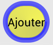 Normal
 Selected
You must be connected to post a comment.